February 11, 2019 •
Posted in
redesign

This is a co-written article. For better context, please skim through what we wrote in the first iteration.
Side projects are teachers, of sorts. After trying to redesign the Google Translate app and failing, Sahil and I tried again. Only while writing about it did we realize we weren’t failing, but making real good progress. We learned to not trust the first iterations of the designs we made and to never give up until we’ve solved what we had first set out to solve.
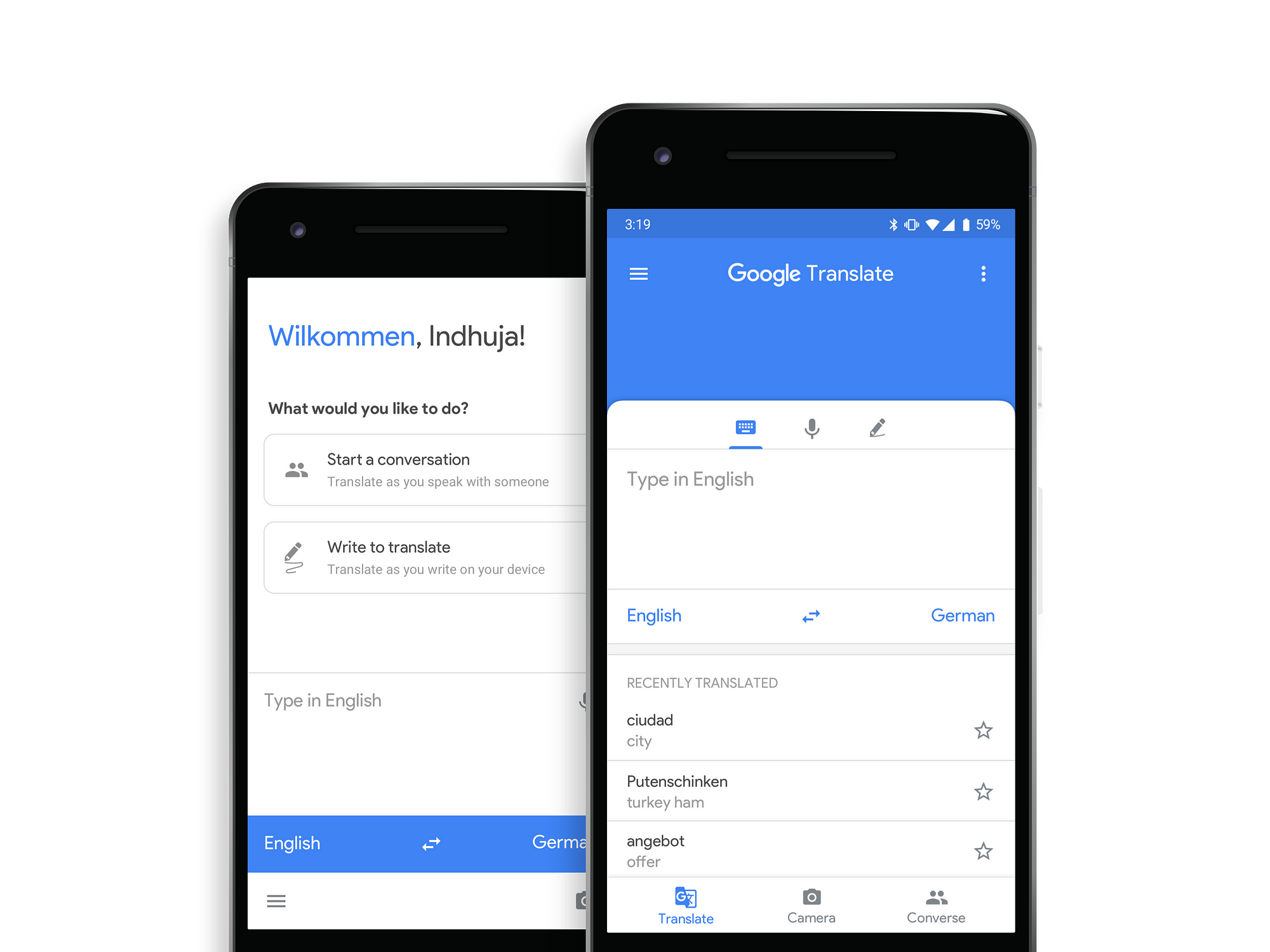
Proposed design for Google Translate. First and second iterations.
Redesigning products that are already great is a very exciting challenge I seem to have taken up since the Gmail redesign.
And well, Google Translate just turned out to be even more exciting.
Background
Google Translate has been nothing less than a blessing since my move to Berlin. Having used it extensively for over 6 months now, I’ve had a few issues as a user and a designer. In the process of rethinking Google Translate, we tried making something that looks new and majorly solves one problem — Reachability.Here’s a first iteration we came up with -
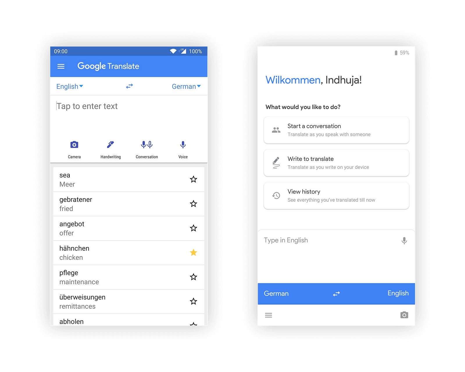 |
| Google Translate’s current home (vs) Our 1st iteration |
Issues & Resolution
Structure
The app is constrained in a few ways in comparison to the desktop version, and for good reason. The app does what it says it does and has a very light and comfortable feel to it. And that’s how apps are supposed to make you feel. But for reasons unknown, the structure or the information hierarchy in the current home screen feels amorphous. That became clear once we had structured the information architecture (IA) in hand.The primary actions on the home screen include- Type, Camera, Handwriting, Conversation, and Voice. These are the five ways Google allows you to translate, via the app.
Of these, the type, handwriting, and the voice options use the textbox element primarily. The Camera and Conversation options do not use the textbox as directly as the other 3 options.
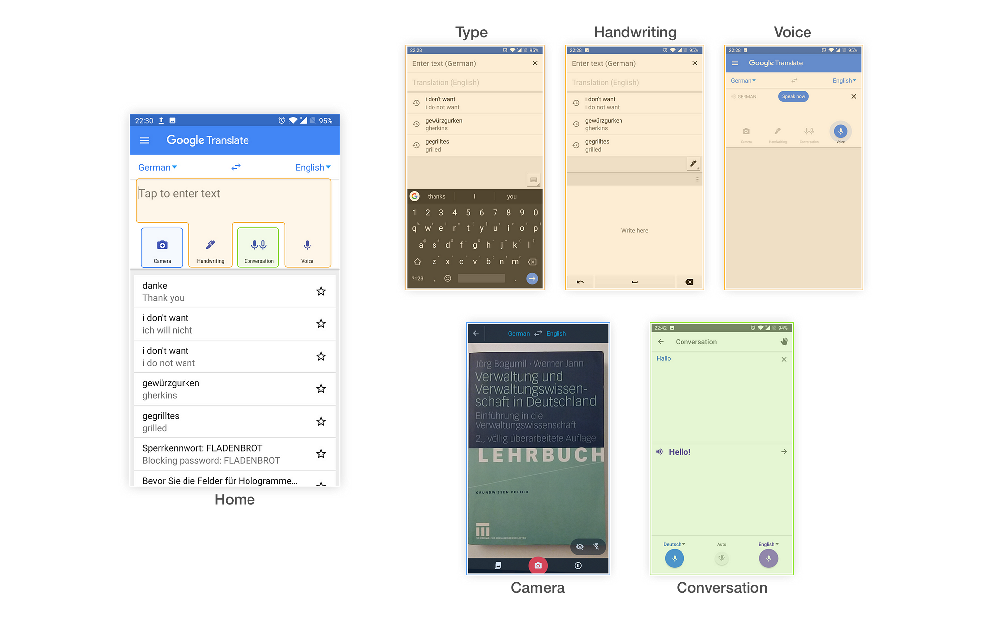
It was only natural that we group the actions that are immediately tied to the textbox and kept it closer to the textbox which binds them. We then arranged the other options in a more accessible space which is not very difficult to adapt to.
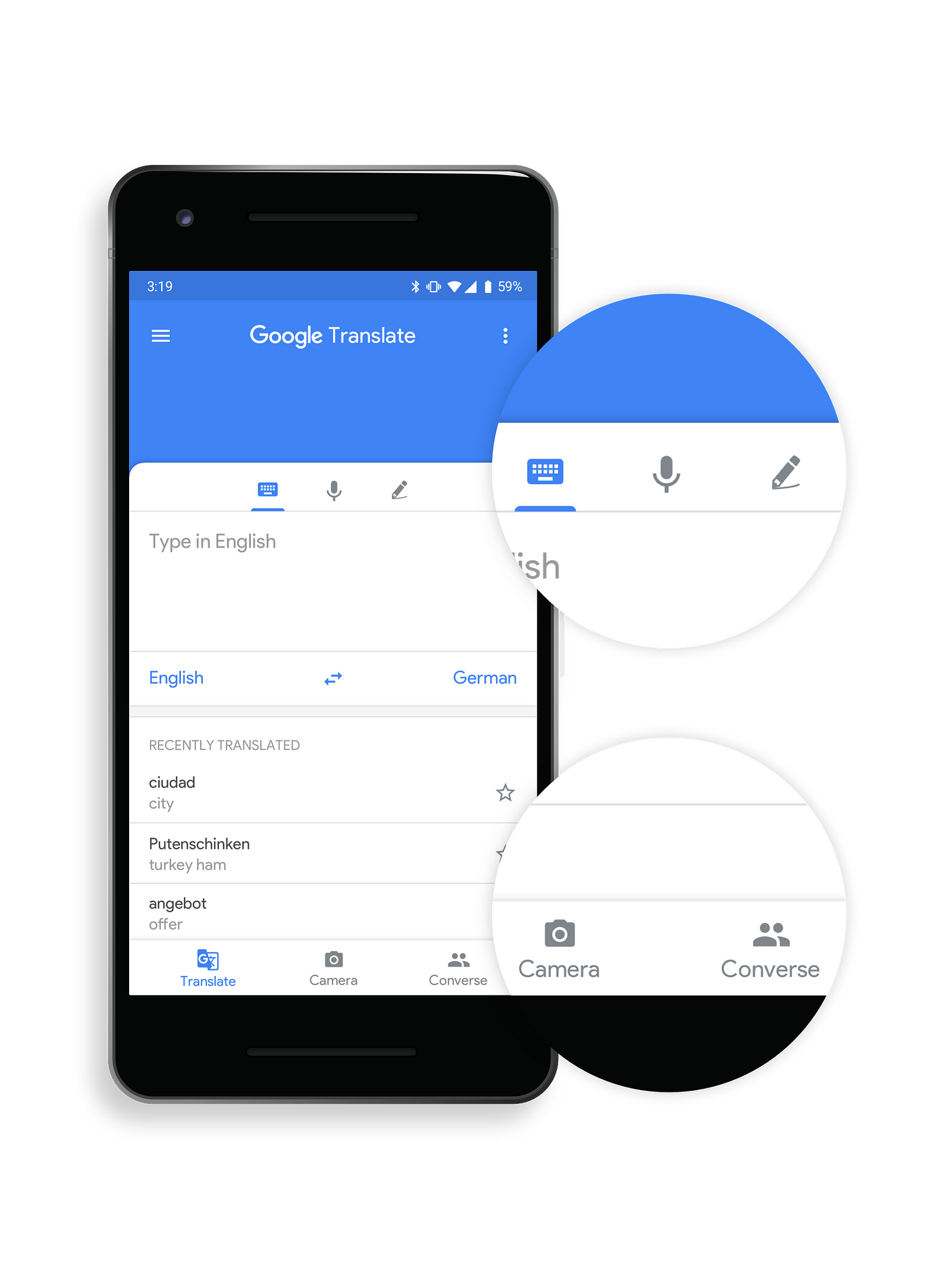
This could take some getting used to. But assuming the positions of the options will solve a major reachability issue for the regular users, adaptability should be swift.
Reachability
As a user, it was an absolute necessity that the actions I frequented were reachable. I used the text box and the camera frequently and it had to be easily accessible. Talking about wants and needs, here are my most frequented scenarios:Open app → Type in German → See in English
Open app → Choose camera → Scan label of the product
Open app → Type in English → Show German translation to someone in the store
Most of the people I spoke to, who use Translate pretty often, also confirmed that they used the text box more often. The camera was the next most used option because German was, again, a new language to them.
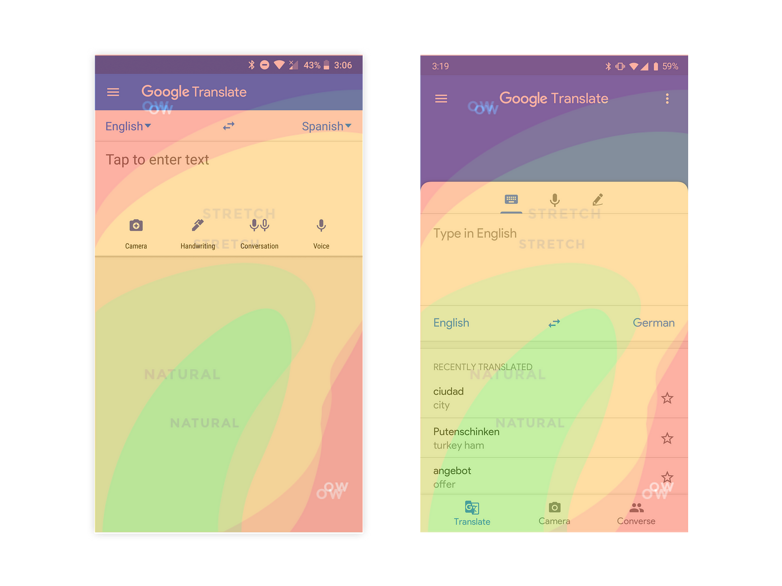 |
| Comparing the “ouch” zones for the current and the proposed design |
Seamless-ness
The type flow in the app is very special because it posed as a cute little 2-screen flow but ended up being so much more.It has always bothered me to have the experience of a text box far from the keyboard. It’s easier when what you type appears closer to where you type it, right? Yes and no.
- Yes, when you’re adding a task or typing in your username or password.
- No, when you’re typing something that will trigger a suggestion list. Because then the list would have to defy gravity. And that’s where we hit a roadblock on our first iteration.
Here’s how the current type flow works:
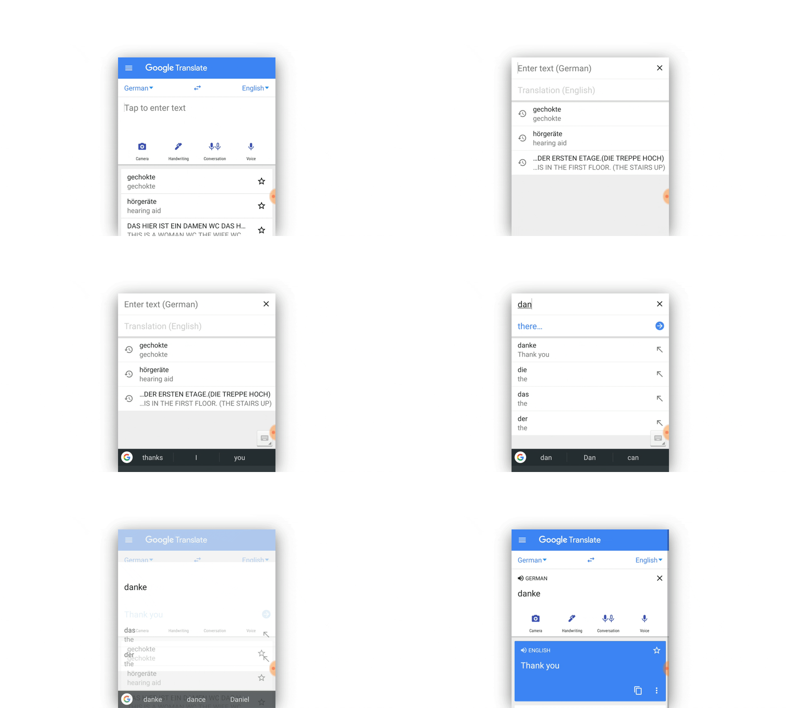
There’s the home state, the typing (or) active state, and the result state. As much as I wanted to reduce the number of transitions, there was not a lot of ways to remove a state.
And I call them states and not screens because that’s what they ended up being; States of the same screen. The first and the third states were ideally the same screens, but the second typing screen looks a lot more disconnected.
As a user in a hurry, I’ve mostly dropped off prematurely in this flow. That’s because you get to see the result of the translation as you type. I just want to know what it means, and I want to know it real quick. And in the current app getting from screen 1 to screen 2 felt like it was taking you to a page exclusive to typing and looked very little like the previous screen.
So we connected the transition and stitched the textbox to be similar on all 3 states in the type flow. The textbox now prevails on all states, making it seem more seamless.
Without changing the information architecture or adding a new feature, we polished the app’s experience and made it more useable.
Speaking from experience, redesigns are a great way to learn. They accelerate your learnings and teach you things in addition to what you learn from the workplace. We would never have learned how rounded corners can make the content pop out of a particular screen.
Iterations are very valuable when it comes to learning from your versions, seeing the possibility of the good that can come out of it. There have been when the second and third iterations have turned up way better than the first. And all this works only when there is good design feedback in the loop.
Iterations are very valuable when it comes to learning from your versions, seeing the possibility of the good that can come out of it.
- No, when you’re typing something that will trigger a suggestion list. Because then the list would have to defy gravity. And that’s where we hit a roadblock on our first iteration.
Here’s how the current type flow works:

There’s the home state, the typing (or) active state, and the result state. As much as I wanted to reduce the number of transitions, there was not a lot of ways to remove a state.
And I call them states and not screens because that’s what they ended up being; States of the same screen. The first and the third states were ideally the same screens, but the second typing screen looks a lot more disconnected.
As a user in a hurry, I’ve mostly dropped off prematurely in this flow. That’s because you get to see the result of the translation as you type. I just want to know what it means, and I want to know it real quick. And in the current app getting from screen 1 to screen 2 felt like it was taking you to a page exclusive to typing and looked very little like the previous screen.
So we connected the transition and stitched the textbox to be similar on all 3 states in the type flow. The textbox now prevails on all states, making it seem more seamless.
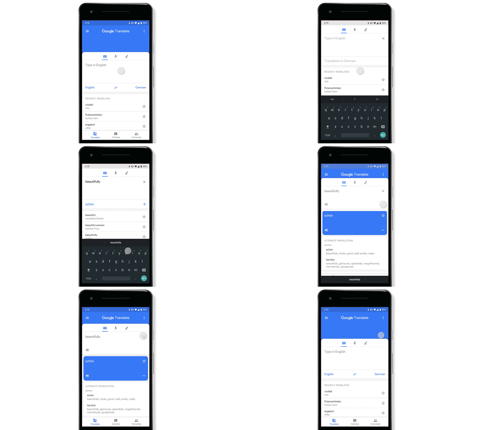 |
| The proposed seamless typing experience |
Conclusion
In the process of re-thinking Translate, we also came across trains of thoughts like making Translate a platform where people learn a language from and other such ideas. We steered clear of all that and ended up keeping the app what it really is- a tool which allows you to Speak to the World.Without changing the information architecture or adding a new feature, we polished the app’s experience and made it more useable.
Speaking from experience, redesigns are a great way to learn. They accelerate your learnings and teach you things in addition to what you learn from the workplace. We would never have learned how rounded corners can make the content pop out of a particular screen.
Iterations are very valuable when it comes to learning from your versions, seeing the possibility of the good that can come out of it. There have been when the second and third iterations have turned up way better than the first. And all this works only when there is good design feedback in the loop.
Iterations are very valuable when it comes to learning from your versions, seeing the possibility of the good that can come out of it.
Interesting links:
Designing the UI of Google Translate — Google Design
3 UX takeaways from redesigning Google Translate — Google Design
Material Design 2.0
Thanks for reading. Do let us know what you think of the redesign and follow us on Twitter @indhujapillai & @sahildave1991
Designing the UI of Google Translate — Google Design
3 UX takeaways from redesigning Google Translate — Google Design
Material Design 2.0
Thanks for reading. Do let us know what you think of the redesign and follow us on Twitter @indhujapillai & @sahildave1991